Three Ways to Beautify Your Reports and Increase Reader Engagement
Want a more polished spreadsheet or report that appeals to a wider audience? Not everyone likes the standard matrix look of a spreadsheet. Or anything that looks like a spreadsheet. You do. We do. Sometimes our audience does not.
As finance professionals and analysts, you’re probably used to working with spreadsheets, large data sets, and complex financial information. However, not everybody reading your reports will be as familiar with the content, making it harder for them to understand the information and stay engaged. Creating a report which is more likely to be read by the audience it is intended for should be one of your goals.
Designing reports that are beautiful as well as functional is key if you want your audience to read and understand your content.
Three Ways to Beautify Your Reports
We’ve highlighted three main ways to improve the look of your reports to improve engagement. We’ve also included a section on practical tips for how to apply these to your reports, so keep reading to learn more!
-
Use Visuals to Create a More Balanced Report
In general, people are better at understanding information presented in a visual format, as opposed to written text.
As most financial reports tend to be text-heavy, it is important to try to break up long blocks or sections of text with visuals. These visuals can include charts, diagrams, infographics, and relevant images. Adding a background image to your spreadsheets to make them “pop” is a good way to grab your reader’s attention and keep them engaged. We show you how in the section below.
Just remember that any visuals you choose to include should help readers understand your content by breaking down, highlighting, emphasizing, or categorizing information.
-
Use Bold Colors to Highlight Important Information
Color can be one of the most engaging elements of any design, and also helps associate readers with your brand. Just look at Coca-Cola and its red cans or McDonalds and its golden arches.
Color can be used to guide the reader’s attention to important information and help the reader navigate through your document. It also breaks up your content (whether it be text or numbers), so that readers can easily find the information they are looking for.
Color can be a powerful tool for highlighting headers or significant data points, but you need to be deliberate in its application. Too many contrasting colors can be overwhelming and distracting to your readers.
To create a cohesive experience for your readers, we recommend using one to two colors that align with your brand across your content.
-
Use Text to Create Hierarchies Within Your Reports and Spreadsheets
As with color, text size and style can be used to highlight important sections and help the reader navigate your report with ease.
We recommend that your report have a text hierarchy of at least three levels and no more than five levels. Having a unique header, sub-header and paragraph text and style is essential; with the header text being the biggest and boldest text and the paragraph being the simplest and easiest to read. The text style should be in line with your company brand assets.
Using pull-out text as a break from the density of a document is a great way to highlight significant data points or information. You can differentiate this pull-out text with a unique text style and size.
Remember to apply this hierarchy to the entire document and keep consistency throughout.
For more tips about reader engagement, read our blog about Storytelling in FP&A.
How to Use Color, Images, and Logos in Your Reports
The first job of a report (like a web page) is to confirm for the reader that they are looking at the right document. To this end, images and logos can go a long way in not only confirming this, but also improving reader engagement. It’s important to be systematic about the way you use them.
To boost engagement of your reports, while still keeping them looking professional, we’ve put together some tips of how best to use color, images, and logos in your reports.
Adding Background Images
Adding a background image to your report or spreadsheet, especially one that is familiar or speaks to your audience, can boost reader engagement.
Use these two tips to ensure that your report does not become too cluttered:
-
Turn off gridlines (View > Gridlines).
You need them to design, and you probably don’t even see them anymore. Casual users do see them, and they don’t need them, and they think, “Uh-oh, it’s a spreadsheet, I must steel myself!”
Simply turn gridlines off before you distribute your report. It’s easier than filling cells with white and doesn’t get in the way of using fills in cells where it makes sense.
To make certain sections or data stand out, for example totals in spreadsheets, consider using a colored gridline for specific rows.
-
Add a low-profile background image to your report (Page Layout > Background > From a file).
Yes, it makes the report a little harder to read, but not every user is just interested in the detail.
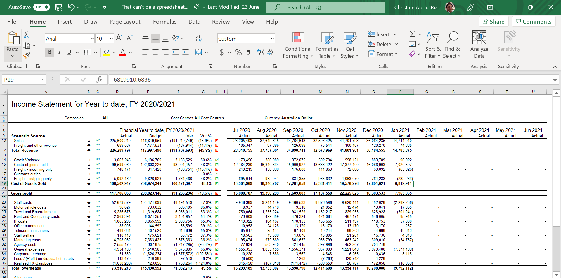
Here’s a decent report:
 Here’s the same report with these tips considered:
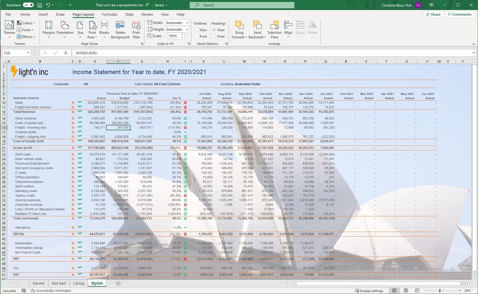
- Color of headings has been changed from black to blue to help grab reader’s attention.
- Company logo has been added to the top left-hand corner.
- Gridlines have been suppressed, and only main lines that are needed to highlight sections or totals are displayed. We’ve also used an orange-colored gridline to further emphasize these main section breaks.
- A background image, recognizable to almost any audience, has been added.
You be the judge! Don’t get hung up on the data or less than useful comparatives and variance calculations used here. This is about the look and feel of the report.
Here are a couple of extra tips for getting your background image right:
- You don’t want your image to detract from the foreground data, so choose a large image with big elements and whitewash it back to barely perceptible.
- To put your audience in a more ‘big-picture’ state of mind and make it easier to absorb your numerical message, choose an image your audience will recognize. This can be something related to your brand or the content itself.
- Excel likes to repeat background images in x and y, so when you create a background image, just add lots of white space to the right and to the bottom. The image will still repeat, but it will do so far beyond the active rows and columns of your sheet–no-one will know. You can do this in any photo editing software.
Using Logos in Your Report
Using logos in your reports can help readers instantly identify that they are looking at the report for your organization. Including logos or images that relate to your brand across your documents can also help with brand awareness.
Like with any visual assets, ensuring your brand is appropriately positioned, sized and is in line with the rest of your content is essential so that it displays correctly and doesn’t distract from the key information in your report.
We’ve highlighted our top five tips for adding logos to your reports:
- Choose a landscape version of the logo that works on the background color of the report. Make sure your logo image contains the standard whitespace you want to use, so you can just drop it into A1, and not worry about fiddling with the spacing.
- Make the logo as big (height-wise) as the smallest report header you anticipate creating. Create an image to match that size and use it always, even if the report header is larger. It’s so much easier to re-use if you don’t have to change the size every time.
- Place the logo on the left-hand side. Different reports may do different things on the right-hand side and will most certainly have different total widths. Placing your report on the left-hand side ensures that it doesn’t interfere with any of the information or data that you are trying to get across.
- Set your column widths so that the header detail always starts at the same horizontal location. In this way, your reports will always look professional and seem amazingly consistent – earning you instant credibility.
- Set the image to move but not resize with cells, and make sure lock aspect is on. This ensures that your logo always displays correctly and isn’t distorted in any way. Remember, if it looks wrong, your report will feel wrong.
Oh, and it doesn’t have to be logos only–if you’re adding in contact details, add a picture of the person. Everyone prefers to engage with someone they have seen. Or even a picture of the product or subject matter–images are not just for PowerPoint!
Explore more insightsoftware blogs to find more handy tips for simplifying the way you work in Excel.
Related Resources

The Path to Data Leadership: Embracing Embedded Analytics